
“Your website is already responsive. The phone is still open normally. But after viewing the product, customers still call to ask for the catalog, ask for each parameter and ask Sales to send a quote via Zalo.”
This is the paradox of business websites: the interface can scale to the screen, but the customer journey is not really designed for mobile devices. On a laptop, the six-column technical sheet looks clear. On phones, the table is cut off or has to be scrolled horizontally. A4 sized PDF files need to be enlarged. The quote request form is at the bottom of the page and has too many fields. The quick call button is covered by another popup.
The problem is not just aesthetic. When B2B buyers are at work, in the warehouse, in meetings or on the go, their phone may be the only device they use to check information. If the website does not help them complete the task, the sales opportunity is delayed, Sales has to redo the work that the website was supposed to support, and the business does not know exactly at which step the customer leaves.
Pain from the market: responsive is not necessarily usable
Public discussions reveal three common types of obstacles.
First, the data panel is wider than the screen. One WordPress user reported that the right side of the table is cut off on mobile and makes it difficult to read the full information. Support feedback identifies this as an inherent responsiveness problem of multi-column tables, requiring the need to choose how to scroll, collapse or change the display structure: https://wordpress.org/support/topic/tablepress-plugin-issue-tables-not-fully-visible-on-mobile-devices/
Second, the form has many elements but touch operations are not tested. A Contact Form 7 case describes a form that is nearly impossible to scroll forward as the fields and checkboxes fill the screen: https://wordpress.org/support/topic/contact-form-not-usable-on-mobile/
Third, product content from themes or editors can still disrupt the mobile experience. On the Shopify community, a merchant encountered a product table that was cut off and forced to scroll horizontally on the phone even though he was using an e-commerce theme: https://community.shopify.com/c/shopify-design/pstige-theme-product-page-tables-not-mobile-responsive/m-p/1885870
These reflections are experiential signals, not representative statistics. However, they point out an important principle: being responsive at the interface frame level does not mean the customer can complete the task.
How does a mobile website directly affect business?
Customers don't see enough information to make a decision
With technical products, buyers may need dimensions, materials, capacity, compatibility, certification or instruction files. If this data is hidden in a large table or the PDF is difficult to read, customers must switch to another channel to ask.
Each channel change creates more friction. Customers must copy the product code, open Zalo, find the correct account and re-interpret their needs. Businesses also lose data about which pages visitors viewed and what criteria they were interested in.
Sales repeat basic consulting work
The website did not complete the step of providing information, causing Sales to resend the catalog, photos, videos and data sheets. Good employees can still handle it, but their time is spent on repetitive tasks instead of consulting and closing complex needs.
How does Google and the platforms currently view mobile?
Google says mobile crawler is the default crawler and recommends responsive web design for new websites. Important content on mobile also needs to be as complete as desktop: https://developers.google.com/search/docs/fundamentals/get-started
Shopify confirms themes in the Theme Store are responsive and the editor allows switching between screen sizes for testing. However, Shopify also notes that many sections, blocks, and mobile settings need to be configured separately. That means the platform provides a responsive platform, but businesses still have to test the content, app, and actual customization: https://help.shopify.com/en/manual/online-store/themes/theme-support/troubleshooting
When do you just need to optimize your current website?

Not every mobile error requires a new website design project.
Keeping the current foundation and controlled optimization is often appropriate when:
– The administration system remains secure and updated.
– Marketing can self-adjust content.
– URL structure and SEO are working stably.
– The problem focuses on some templates, tables, PDFs, popups or forms.
– Current integration still meets operational requirements.
Optimization could include converting dashboards to cards, placing pre-decision information in PDF, shortening forms, editing CTAs, and testing on real devices.
When is Haravan or Shopify a reasonable choice?
Haravan, Shopify or equivalent subscription platforms are suitable when businesses prioritize:
– Sales and catalog management according to standard structure.
– Quick deployment on maintained theme.
– Use the payment, shipping, marketing and application ecosystem.
– The operations team wants to reduce the amount of technical infrastructure and must self-manage.
The benefit is that the platform offers many available components and a centralized update mechanism. Shopify also allows store management and previews on both desktop and mobile.
Points to note:
– Responsive themes do not guarantee that technical panels or third-party apps will be optimal.
– Deep customization can depend on theme structure and support policy.
– Businesses still need to own accounts, domains, data, legal themes and configuration documents.
When should you redesign your business website?
Website redesign is appropriate when the problem no longer lies in a few screens but comes from the old architecture:
– Important content cannot be prioritized differently between desktop and mobile.
– Theme or framework is outdated and difficult to update.
– Many plugins overlap and create conflicts.
– Marketing does not manage the page, CTA or form itself.
– Product data is unstructured.
– No testing environment and release process.
– Ownership of source code, hosting or account is unknown.
When does a custom website or combined solution create value?
A custom or hybrid website can make sense when a business needs a unique mobile journey:
– Find products by code, attribute or compatible device.
– Configure products according to conditions.
– Compare multiple options without using desktop tables.
– Create a quote request with the selected product.
– Dealer Portal or Customer Portal.
– Documents according to access rights.
– Connect CRM, ERP, WMS or vendor API.
The disadvantage is higher survey, development, testing and maintenance costs. A custom website is only worth investing in when the specific journey brings clear operational or sales value.
What are businesses paying for when upgrading their websites?
Project value is not just in code or page numbers. Scope may include task survey, content architecture, responsive UI/UX, data structure, integration, real device testing, training and handover. The design needs to have appropriate breakpoints, grid, safe margin, click size, error status, and content order. Businesses need to hold domain names, platform accounts, data, analytics, source code according to contracts, licenses and backup documents.
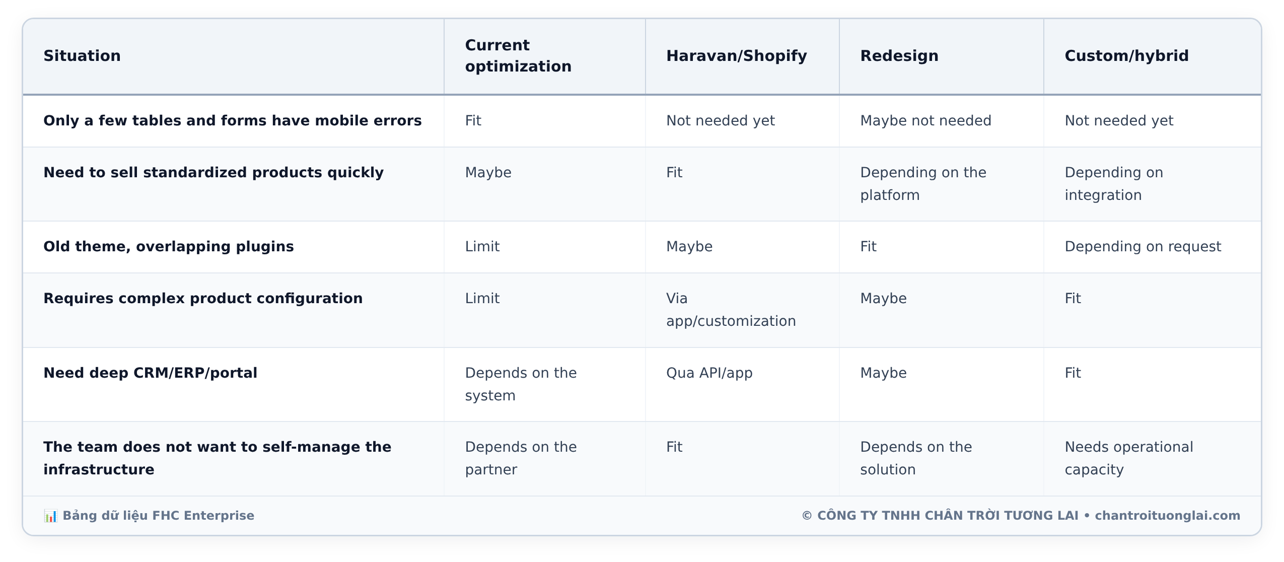
Quick selection matrix
| Situation | Current optimization | Haravan/Shopify | Redesign | Custom/hybrid |
|---|---|---|---|---|
| Only a few tables and forms have mobile errors | Fit | Not needed yet | Maybe not needed | Not needed yet |
| Need to sell standardized products quickly | Maybe | Fit | Depending on the platform | Depending on integration |
| Old theme, overlapping plugins | Limit | Maybe | Fit | Depending on request |
| Requires complex product configuration | Limit | Via app/customization | Maybe | Fit |
| Need deep CRM/ERP/portal | Depends on the system | Qua API/app | Maybe | Fit |
| The team does not want to self-manage the infrastructure | Depends on the partner | Fit | Depends on the solution | Needs operational capacity |
BẢNG DỮ LIỆU CHI TIẾT • CHẠM ĐỂ PHÓNG TO
🔍 Mở toàn màn hình (phóng to/thu nhỏ)
Checklist mobile task audit cho SME
– Choose the five sites that create the highest value and open them with two real phones.
– Find products by code and by need.
– Read data sheets, view documents and complete forms without zooming.
– Verify the CTA is not covered and leads to the correct system.
– Check Marketing and self-edit content.
– Confirm ownership of accounts, data and source code according to the contract.
How FHC advises and implements
Future Horizon positions itself as a consulting and implementation partner, not just an interface redrawing unit. Based on the current service page, FHC provides website design that integrates computer and phone interfaces; At the same time, the FHC website introduces API, CRM integration and technology transfer capabilities: https://www.chantroituonglai.com/service/dich-vu-thiet-ke-website and https://www.chantroituonglai.com/lien-he
A realistic roadmap might include:
1. Inventory of digital assets, access rights and platforms.
2. Select important mobile tasks.
3. Audit on real devices.
4. Suggest keeping, optimizing, changing themes, switching platforms or building a custom MVP.
5. Prototype design and acceptance criteria.
6. Deployment, integration and testing.
7. Training, document handover and post-release monitoring.
FHC does not assume that a separate website is always better. The appropriate plan must be based on the business model, data, content, SEO, budget, integration and operating capacity of the business.
FAQ
Does a responsive website need to be redesigned?
Not necessarily. If the platform is still good and errors are concentrated in a few tables, forms or templates, you should optimize according to the scope first.
Does mobile-first mean ditching the desktop version?
Are not. Mobile-first is about prioritizing important tasks and content for small screens, then extending a consistent experience to other devices.
Does using Shopify automatically fix mobile errors?
Are not. The official responsive theme creates a good foundation, but the content, tables, apps, and customizations still need testing.
Which businesses is Haravan suitable for?
Usually suitable for businesses that need a website for multi-channel sales and operations based on a standard structure. The specific level of coverage should be based on actual features and integration.
Is a custom website better for SEO?
No default. SEO also depends on content, structure, crawlability, performance, structured data and long-term operation.
Should we keep the spec sheet on mobile?
You can keep it if the client needs an exact match, but consider cards, attribute groups, sticky columns, or detailed views instead of just minimizing.
What must businesses own?
Domain name, platform account, hosting model, data, analytics, theme/plugin license, contract source code, documents and backup information.
Conclude
A website that can be opened on a phone may not help customers complete their work. A business website creates value when visitors can find, understand, compare and submit needs in their real-life context.
There is no one best option for every SME. Haravan or Shopify may be the right option when you need to operate quickly on a standard platform. The current website may just need to correct the bottlenecks. A custom or hybrid website is appropriate when unique journeys, data, and integrations create enough value.
Start with a mobile task audit, not with a “complete rebuild” decision.
☎️ Hotline: 0325.112.310
📧 Email: [email protected]
🌐 Website: https://www.chantroituonglai.com
Reference source
- wordpress.org — wordpress.org
- community.shopify.com — community.shopify.com
- developers.google.com — developers.google.com
- help.shopify.com — help.shopify.com

Author
Customer Care