Landing page (also known as landing page) is one of the extremely important elements in any marketing campaign. Businesses that increase the number of landing pages from 10 to 15 can increase the number of leads by up to 55% throughout the month.
Let your page visitors react with the same excitement as the guy on the left, not the guy on the right
Is building a good landing page much easier than building a full website? After all, it's just a single page, with a single goal of getting visitors to leave their information to make a purchase or get a consultation. No need for cumbersome style guides — just creativity.
Well, there are many factors to pay attention to when designing a landing page that you may overlook. What matters most is “conversion” — getting users to take the specific action you want them to take — and how you can maximize it.
# What is conversion-focused design?
Marketing campaigns are based on a single purpose and need to focus heavily on user experience. An experience that can convert visitors into customers.
Landing pages focus on a single purpose — the defined purpose of the campaign.If you start building without a clear idea of what you're aiming for, you won't succeed. This forms the basis of a conversion-focused design (CCD — Conversion — Centered Design) — a design that aims to achieve a conversion goal.
In other words, it's all about persuasion. And the design rules change quite a bit when it comes to designing conversion-focused landing pages.
The 3 principles of Conversion Focused Design
#Rule #1: Keep your visitor's attention
Your entire landing page should focus on convincing visitors to take a specific action. This action can be downloading an Ebook, using a service, buying a product or receiving further advice,…
And every single factor will contribute to this goal. The less distractions, or “leakages,” the better the results.
A landing page, in most cases, has a 1:1 attention ratio. Attention rate is the ratio of things a user can do to the number of things the user should do, which, for Marketing campaigns, is always one.
This is why your marketing campaign should link to a page dedicated to traffic. This will help a lot in reducing distractions and page bounces. In most cases, your company's homepage cannot make a specific campaign successful. So, if your ads link to your homepage, the number of traffic leaks will increase and will have a negative effect on your campaign.
Achieve a 1:1 landing page acquisition ratio
Take a look at the landing page framework below. It has a single call-to-action (CTA), so there's only one thing to do here — a 1:1 attention ratio. The purpose of the page is clear: click the call to action button.
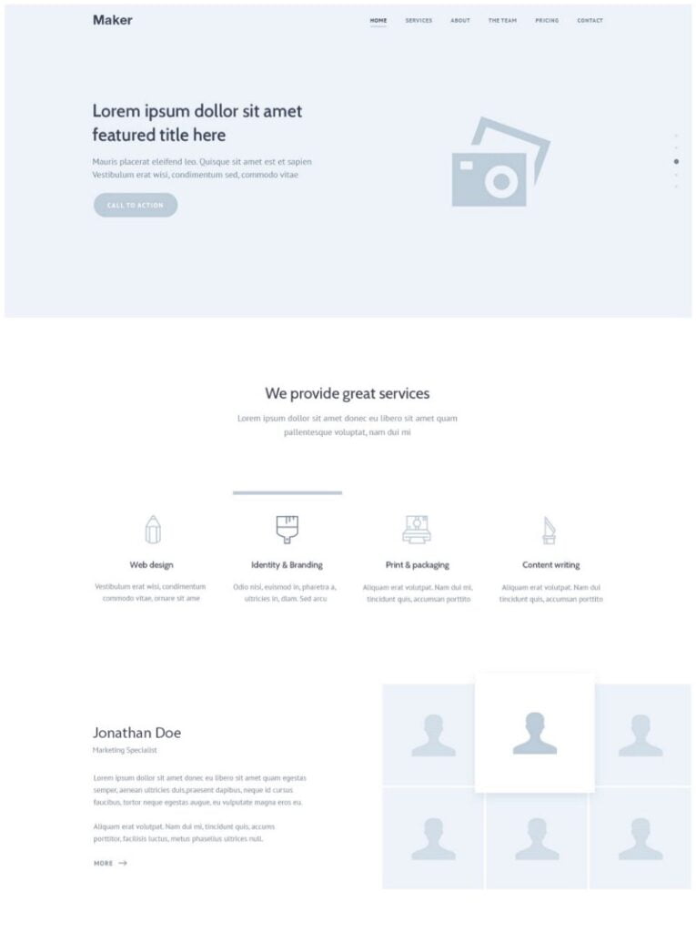
Remove your navigation bar
- Yuppiechef saw a 100% increase in conversion rate (from 3% to 6%) by removing their navigation bar
- Career Point College removed the top navigation bar and modified the form layout, increasing conversion rates by 336%.
- SparkPage's conversion rate increased from 9.2% to 17.6% in the month they ran their top navigation removal test.
Since your landing page is for a single purpose, your visitors should just stay there — moving to any other page will distract your users. This said, a navigation bar with links to different sections on the same page can be useful.
Make your CTA “speak”
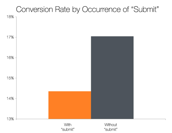
Don't keep the default boring ‘Send' text on the Call to Action button.
HubSpot tested buttons with the text ‘Submit’ against buttons with other phrases. The results are shown above.
Exception to 1:1 ratio
On long landing pages, you can Use multiple buttons with the same target , with the intention that the text surrounding it might have persuaded the reader.
As mentioned earlier, it can be useful to have a navigation bar with anchors to different sections on the same page
#Rule #2: Put things in context
On-page context must be strong and convincing, to increase conversion rates. This requires content to follow the user — how many users already know and what they need to know for you to convince that person.
The channel used to bring visitors must give a brief outline, not details, as advertising has certain limitations. Your job is keep the main message the same as the ad's message and provide additional information to further persuade.
Title importance
The headline is the primary medium through which you can convey the promise and message you have delivered through the ad. After all, the visitors are already interested enough in the main goal of the campaign. So there's less chance if you keep convincing them with more information on the same page, and they leave (and if the ad makes false promises).
The headline should also convey the exact point of the campaign and explain what the page is about. There is a further elaboration on this point in the next aspect of conversion-focused design.
The headline should appear ‘above the fold’ and should be the clearest piece of text.
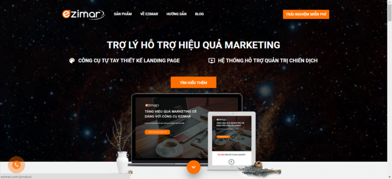
Ezimar's landing page has a central and distinct headline that states their main and only goal with a sub-headline that clearly shows their main product. They remembered the principles.
#Rule #3: Achieve clarity
This seems like a pretty simple principle, but many landing pages lack this — both in their content and in their design.
79% of web users scan pages instead of reading. If we make visitors have to read each section carefully to find information, conversion rates will decrease.
Information hierarchy
Information hierarchy is the order in which elements on a page are presented. Elements should have a proper flow and should be connected, with the necessary components having visual dominance.
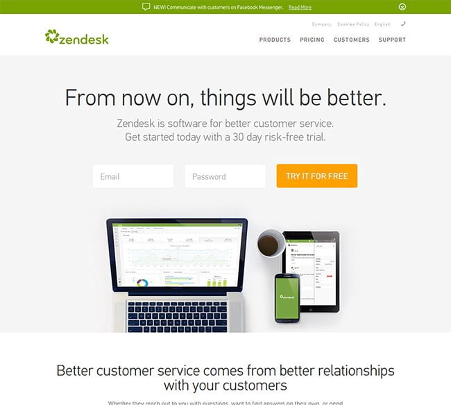
Image source
Back to title. The headline of the page above is quite clear.
A great way to check the clarity of your design is to take a full-page screenshot. Do important elements stand out? Is it enough to properly explain your service, offer or whatever you're aiming for?
I read this quote about keynotes and it can be applied quite well to transition-centric design patterns:
“A good speech should be like a woman's dress; long enough to cover the subject and short enough to create interest.”– Winston S. Churchill
Clear vs Smart
If I had to choose one, it's obvious. Always be clear. Try to be smart when it comes to clarity. This can significantly improve conversion rates. CopyHackers did a test with three variations of the same copy. The results showed that copy with a clear message and a light dose of humor achieved the best results.
Your landing page visitors need to understand:
- (1) where they are
- (2) what they can do on your website
- (3) why they should switch.
If you are unclear about any of these, you will lose credibility and visitors. But once you have the necessary messages, add a little humor and creativity. If your message makes your target customers smile, you will be more likely to be remembered. And in a sea of Google search results, being memorable is a very good thing.
To bring customers to your product, you need to have a truly attractive landing page to make them stop at your product. To have such a landing page, you need to really understand your customers, pay attention to the Call-To-Action (CTA) button and even the product, service or industry you are pursuing.
wp:core-embed/wordpress {“url”:”https://www.chantroituonglai.com/top-10-landing-page-co-ty-le-chuyen-doi-cao.html”,”type”:”wp-embed”,”providerNameSlug”:”chan-heaven-future”,”className”:””}
Author
BIÊN TẬP VIÊN FHC