
To bring customers to your product, you need to have a truly attractive landing page to make them stop at your product. To have such a landing page, you need to really understand your customers, pay attention to the Call-To-Action (CTA) button and even the product, service or industry you are pursuing.
Unbounce
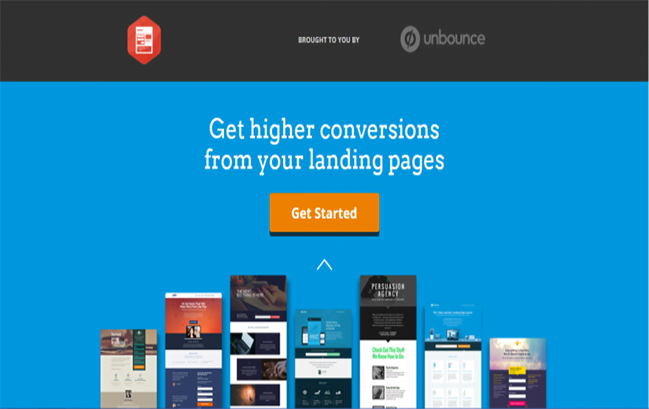
Unbounce is considered one of the top great Landing pages thanks to its catchy title, simple CTAs, and eye-catching visual images. It's not surprising because Unbounce itself is a landing page design site, so creating such an attractive landing page is really easy for them.
Overall design of the above landing pages Unbounce are SEO optimized with enough content to retain customers and create interaction, as well as not confusing customers with clearly presented details.
Wistia
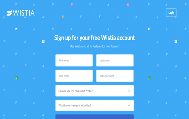
Wistia Very clever in combining the two colors blue and white to create a feeling of harmony and attraction that immediately hits the viewer's intuition. As soon as customers open the page, they will immediately see the registration form, preventing them from wasting too much time performing unnecessary operations. External links have been removed, to avoid any distractions to customers.
H.BLOOM
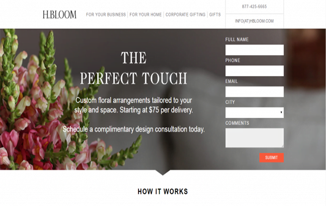
Bloom The design is very simple but brings together the attractive elements worthy of a landing page: beautiful, attractive images, impressive fonts, and a compact but still eye-catching white registration form.
Right next to the registration form is a short explanation for customers to understand what will happen when they sign up. A “Submit” button with bright colors attracts customers' attention and stimulates them to take action.
American Bullion
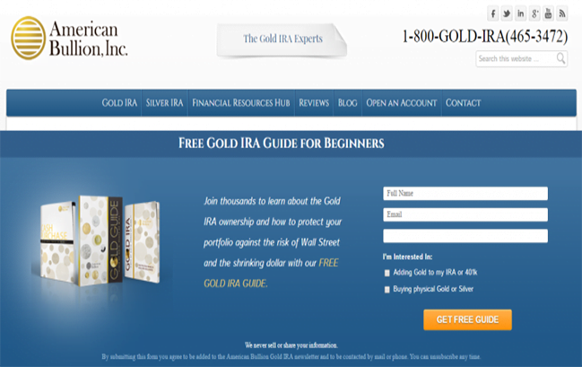
Attractive title of American Bullion is to help customers immediately understand an overview of the page without having to spend a lot of time.
The introduction is not too long but still provides enough information for customers to understand what the main goal of this landing page is. The Call-to-action button is simple but no less attractive when using bright tones. In addition, the endorsement symbols below help increase credibility as well as provide more complete information about the company.
Oprad Sweepstakes
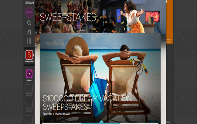
This is a very authentic landing page for my brand Oprad , it exudes optimism and joy with its imagery Oprad smiling brightly right on the page header. Here, the page uses images as CTA buttons to create curiosity, making it difficult for anyone who visits to miss it.
Neil Patel
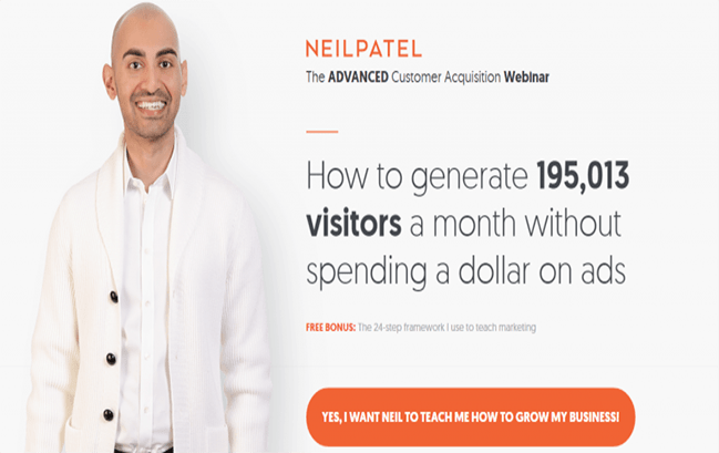
Official website of Neil Patel is another great example of a focused Landing page, it makes it clear to customers the most specific direction by giving exact numbers in the brief description. At the same time, images Neil Patel Smiling makes the page feel more friendly.
The long orange CTA button helps customers clearly see that they will receive many benefits to develop their business when clicking here.
Bills.com
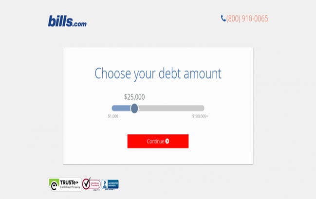
This landing page brings a very gentle and fresh feeling with the combination of 2 white and blue tones. Minimizing images helps viewers not be distracted and clearly understand the message this landing page brings.
Customers just need to scroll and click on the CTA to continue with their steps.
Webprofits
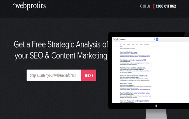
Webprofits Designed on a black and gray background, but thanks to that, the contrasting white text content on it stands out. The sample registration form takes the website address and a bright pink CTA button that stimulates visitors to continue taking action.
This landing page includes very complete information about Webprofits and the services they provide. Inserting multiple CTA buttons on each page is a clever way to remind customers to take action.
Basecamp
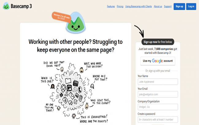
Designed with cute cartoon characters, landing page of Basecamp expressed his goal in a very humorous way. The registration form is placed on the right hand side very simply and clearly, the clever link arrow on the page guides customers to sign up. In addition, placing a fixed form that does not move when scrolling will create seamlessness and ensure that it does not cause discomfort to customers.
Netflix

Landing page of Netflix is also a good example of how to build a compelling CTA button. After visitors read the title, they will know what the next step is. Here, Netflix used a red button with a very attractive invitation ” Join Free for a Month ” makes it difficult for anyone passing by to miss.
With an impressive Landing page, you can improve conversion rates as well as increase sales. If you have good and attractive content but the effectiveness is not high, review your landing page to see if it is enough to stimulate customers to take action?
Having a Landing page with a high conversion rate is not an easy thing. However, sometimes just a few small changes such as CTA buttons, colors or the way you display content on the registration form bring incredibly high conversion rates. Try A/B testing many aspects of your Landing page to see which details are most attractive to your specific customer audience.

Author
BIÊN TẬP VIÊN FHC